Financial rotation in ten charts
By Generali Investments’ Research Team
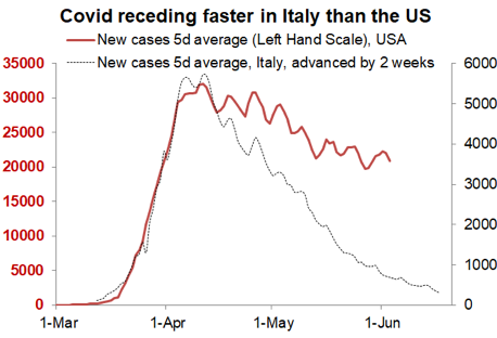
Social distancing makes a huge difference. Covid has receded in the developed world, and much faster in countries that have observed strict social distancing, for instance much faster in Italy than in the US (see chart). The protests (George Floyd), notwithstanding their merit, may only aggravate the matter in the US.
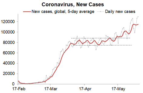
Arguably, those countries successively flattening the curve now may be more exposed if and when a second Covid-19 wave appears. But given the hopes of future medical breakthroughs and the uncertainties regarding the persistence of the immunity, there is little doubt that flattening the Covid-19 curve has been a life-saving strategy. Sadly, the situation remains critical in some emerging market economies. In fact the global number of new cases increased in late May and hit a record high on 4 June (see chart). So the world is not out of the woods.
Risks are balanced: a medical breakthrough (a drug or later on a vaccine) would accelerate social normalisation but for now (or this autumn) the main threat consists in a new wave of contagion as social distancing eases off.
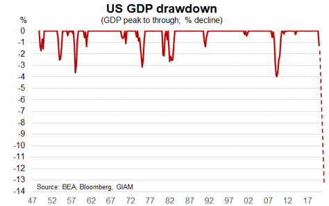
Financial markets: policy trumps the economy. The ECB on Thursday 3 June cut its euro area (EA) forecast to -8.7%. Ours stands at -10%; we see global growth at -4.8% this year. We estimate that in just two quarters, US GDP has lost at least 13%.
This is three times the drawdown experienced during the Great Financial Crisis (GFC). In the Euro area, GDP has probably dropped by about 18% from peak to bottom, again three times the shock of the GFC. The impact on balance sheets and employment are such that business expenditures and consumer spending will be durably impaired. Pent-up consumer demand will ensure a strong recovery in Q3, but do not read too much into it; we will be lucky if by the end of 2021global GDP has fully recovered.
Yet for now financial markets are celebrating the reopening of the global economy and the ongoing barrage of policy actions. The ECB has just announced an extension of its Pandemic Emergency Purchase Programme (PEPP) from €750bn to €1350bn and from December 2020 to June 2021; it also committed to reinvesting the maturing PEPP principal payments until end 2022, basically ensuring that its balance sheet will be durably bloated.
Almost simultaneously, Germany announced a €130bn (3.8% of GDP) fiscal initiative for 2020-21; this includes 2% of discretionary stimulus for this year (1.5%) and next (0.5%), in the form of a temporary VAT cut, a one-off family support, help to local governments etc. We also expect the EC’s proposal of a €750bn Recovery Fund (6% of EU GDP) to be ratified with limited watering down. US policy makers are working on an additional fiscal package, in the region of $1 trillion, which will likely push the US public deficit above 20% of GDP!
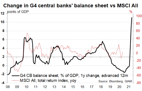
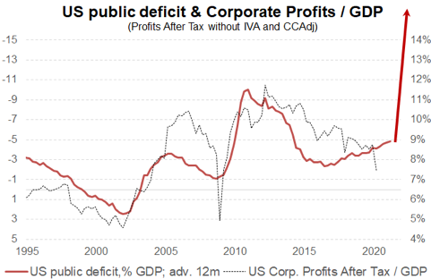
The two charts below highlight how policy can profoundly impact financial markets. The balance sheet of G4 central banks is up by almost 10 points of GDP already this year. By yearend we should be close to 20 points. Historically money printing has supported risky assets, e.g. equity prices (left-hand chart). QE in 2020 is dwarfing all previous episodes. Over the past 25 years fiscal deficits have also benefited corporate profits disproportionately. This may be less true this time, because the impulse from tax cuts and globalization will be missing. Still profits will recover faster than GDP (right-hand chart), and this already contributes to bolstering equity valuation.
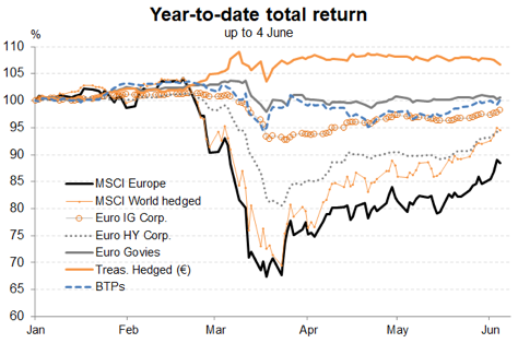
Financial rotation towards laggards and cyclical assets. Our portfolio recommendations retains a pro-risk bias. Until now this has been a cautious tilt, skewed towards IG credit and defensive stocks. In hindsight our small equity overweight recommendation since early April has been too cautious; the S&P has already recouped 75% of its losses! Also over the past three weeks, laggards and cyclical assets have started to outperform.
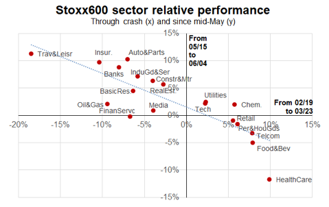
The left chart below shows that European equity sectors that suffered the worst (best) performance during the crash (from 19 February to 23 March) have recorded the best (worst) performance since mid-May; for instance contrast Travel & Leisure and Insurance with Healthcare and Food & Beverage.
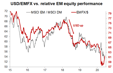
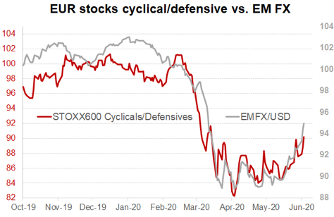
EM currencies, a very cyclical asset, are bouncing back while cyclical stocks are outperforming defensive (right-hand chart); likewise, European equities are catching up with the US a bit.
Conclusion: Are investors getting carried away and too optimistic about the economic recovery? Maybe, but the recent rotation primarily reflects short covering.
In fact surveys suggest that investors have been rather defensive through the financial rebound of the past two months. Cash positions are still large and equity funds have generally suffered outflows (the past week has seen inflows though). The rotation may continue into summer (with much greater moderation) as the global economy resuscitates and global investor pessimism fades.
But our view of a swoosh recovery, rather than a V, argues against a full-blown financial upswing.
Typically, we see the recent rise in bond yields as overdone: 10-year Bund yields have jumped from almost -0.60% to -0.30% in five weeks. We expect bond yields to stay low in an environment dominated by disinflation and central bank buying.
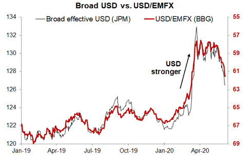
We will be watching FX trends very closely. The US dollar soared in March, but has now given back half of its gains. Extraordinary debt monetization, very dovish forward guidance from the Fed and the November election may well feed the pullback of the dollar. This would be most beneficial to EM equities, which have lagged in the recent catch-up.